Урок "Colors. Terms: Hue, Value, Intensity»
Методична розробка відкритого заняття
з дисципліни:
«Іноземна (англійська) мова за професійним спрямуванням»
за темою: «Colors Terms: Hue, Value, Intensity»
Хід заняття:
- Організаційна частина заняття
Good morning students! How are you? Who is absent today? Are you well ?
2. Актуалізація опорних знань:
- Перевірка домашнього завдання.
Ok, during some last lessons we began to learn such topic as ART. Let’s remember some general points:
- What elements of art do you remember?
- Name the five directions a line can take.
- (гра «Назви лінію»)
- Describe some pictures.
3. Доведення теми заняття.
Today we continue to learn elements of art. Let's get acquainted with the topic COLORS
4. Мотивація навчальної діяльності.
Our world will be so boring without colors, they help us to express our feelings more deep.
What colors do you know? ( перегляд відео)
- введення нового лексичного матеріалу по темі:
Ex. 1. Прочитайте та запам’ятайте наступні кольори:
- beige [beıʒ] бежевий
- black [blæk] чорний
- buff [bʌf] темно-жовтий
- chlorine ['klɔ:ri:n] світло-зелений
- claret ['klærət] бордо
- coral ['kɔrəl] коралловий
- gray, grey [greı] сірий
- green [gri:n] зелений
- khaki ['kɑ:kı] хакі
- lilac ['laılək] бузковий
- magenta [mə'ʤentə] пурпурний
- maroon [mə'ru:n] темно-бордовий
- navy ['neıvı] темно-синій
- olive ['ɔlıv] оливковий
- orange ['ɔrınʤ] оранжевий
- pearl [pə:l] перламутровий
- Pink, rosy [pıŋk] рожевий
- plum [plʌm] сливовий, темно-фіолетовий
- purple ['pə:pl] пурпурний, багряний
- red [red] червоний
- turquoise ['tə:kwɑ:z] бірюза
- vinous ['vaınəs] бордовий
- violet ['vaıəlıt] фіолетовий, темно-ліловий
- white [waıt] білий
- yellow ['jeləu] жовтий
Ex. 2. гра «Назви лінію»
Ex. 3. Прочитайте та перекладіть текст:
Imagine a world without color. Like lines, color surrounds us. It is in the reds and purples of the sky at sunset. It is in the lush green of a well-tended lawn. Our moods even have “color.” We describe someone who is angry as “seeing red.” A happy, carefree person is said to be “in the pink.” In this lesson, you will learn about the way color is used in art. In the next lesson, you will practice using color yourself.
PROPERTIES OF COLOR
Have you ever tried to find a pair of matching socks on a dark winter morning? It is not easy. Without light, all colors look the same. Scientists and artists have long understood this. Both know that color is what the eye sees when light is reflected off an object.
Some artists use color boldly. Others use it softly. To get these results, artists need to understand the three main properties of color. These are hue, value, and intensity.
Hue
Hue is a color’s name. Orange, green, and violet are all hues. Three of the hues —red, yellow, and blue—are known as the primary, or pure, hues. They are called primary because these three are mixed to create all the other hues. Mixing the two primary colors of yellow and blue gives green, a secondary color. Mixing a primary color like red with a secondary color like orange gives red-orange, an intermediate color. Look at the painting in Figure 8–1. The artist has overlapped hues to capture all the colors of the rainbow. Match the hues in the painting with those on the color wheel. Has the artist used any primary hues? Which secondary hues has she used? Which intermediate hues has she used?
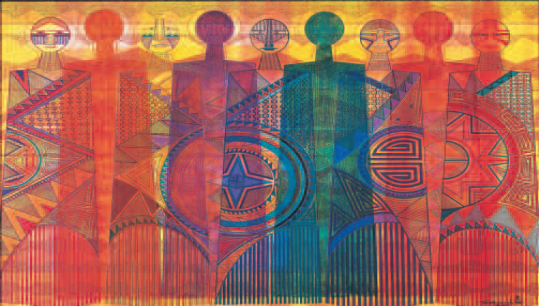 Figure 8–1
Helen Hardin. Robed Journey of the Rainbow Clan. 1976. Acrylic. 47 _ 76.2 cm (181⁄2 _ 30_). 1996 Helen Hardin, © 1999 Cradoc Bagshaw
Value
The art element, value, is the lightness or darkness of a hue. Value is also considered as a property of color. You can change a hue’s value by mixing in white or black. When white is added to a hue, the resulting color is said to be a tint. When black is added, the result is called a shade. Pink is a tint of red. Maroon is a dark shade of red.
Intensity
Some colors appear lively and brilliant. Others look murky or dull. The difference is called the color’s intensity. This is the brightness or dullness of a hue. A strong, bright hue is said to be “high-intensity.” Pure green is such a hue. A faint, dull hue is said to be “low-intensity.” Olive green is a hue that fits this description.
One way of lowering a hue’s intensity is by mixing it with its complementary, or opposite, hue on the color wheel.
Ex.4. Доповніть речення використовуючи текст:
- Both know that color is what the eye sees …
- They are called primary because …
- Mixing a primary color like red with a secondary color like orange…
- This is the brightness or …
- Olive green is a hue…
Ex.5. Опис картинки
Ex. 6. Прослухайте текст та заповніть пропуски:
The three primary 1…… are red, yellow, and blue. You can combine these colors to create secondary colors. Adjust the amounts of each pigment to 2…… more hues in between. Each hue appears in a variety of shades. A color wheel shows the full spectrum of colors. It helps you 3….. how different colors interact. It shows simple combinations of complementary colors for beginner artists.
Once you understand colors, you are ready to use them. Ask yourself what level of 4…… you need. Do you want a soft, dull yellow? Or would you prefer a bright, vibrant red? The possibilities are truly endless.
Ex. 7. Визнaчте, пpавдиві (T) подані нижче речення чи ні (F):
- Blue is one of the primary colors.
- Complementary colors are shown on the colorwheel.
- To use colors you can understand them.
Вправи для додаткове виконання
Ex. 8. Поєднайте подані слова та вирази з їх визначення:
1 dull
2 vibrant
3 complementary color
4 intensity
5 color wheel
A a circular chart that shows different colors
B how strong something is
C strong or bright
D a hue that does not contain the same primary colors as another hue
E not strong or bright
Ex. 9. Прочитайте речення та заповніть пропуски найкраще підходящими словами або виазами:
1 primary colors / secondary colors
A Red and yellow are ______________.
B Green and orange are _____________.
2 shade / hue
A The painter mixed two different colors to create a new ______________.
B Add more black to make a darker ______________.
3 pigment / spectrum
A The art student bought a chart that showed the whole ________ of colors.
B The artist ran out of the red ________ so she used violet instead.
6. Підведення підсумків:
- узагальнення матеріалу:
Ok, today we learned such element of art as Color. Let’s remember:
- what is the definition of color? ( Define the term color).
- what are the three properties of color?
- оцінювання студентів
Домашнє завдання:
Ex. 1. Вивчити назви кольорів.
Питання для самоконтролю:
1. Define the term hue.
2. What are the three properties of color?
про публікацію авторської розробки
Додати розробку